


7
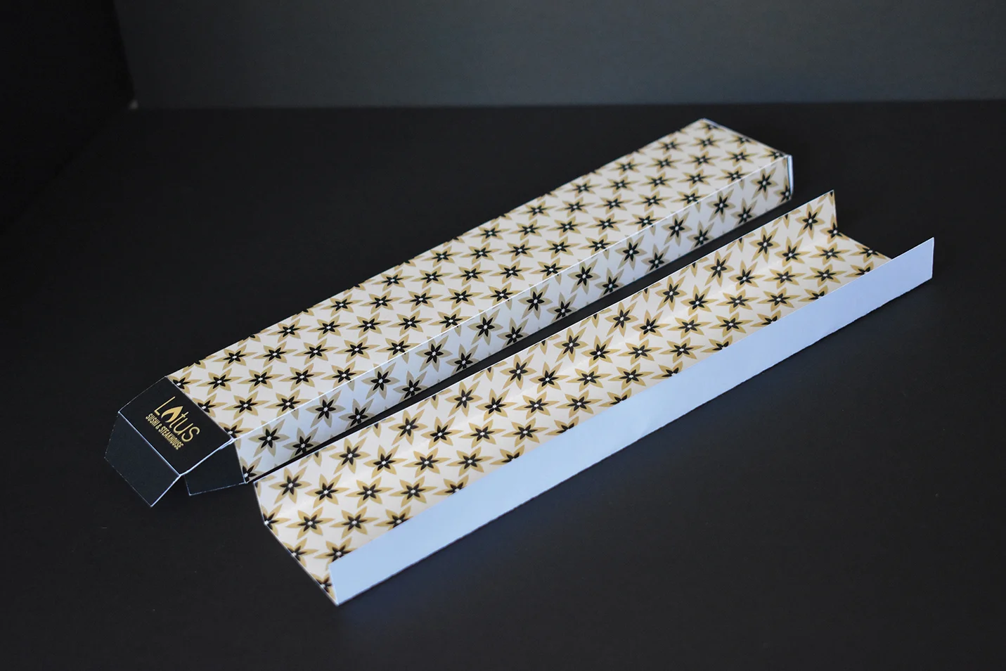
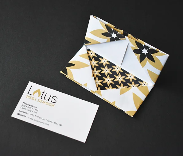
Lotus Sushi & Steakhouse

8
Don't Be Like Frank

4
Have You Seen Us?

4
Wood Type Postcards

5
GPS Brochure

6
Hypothetical Car Brochure
5
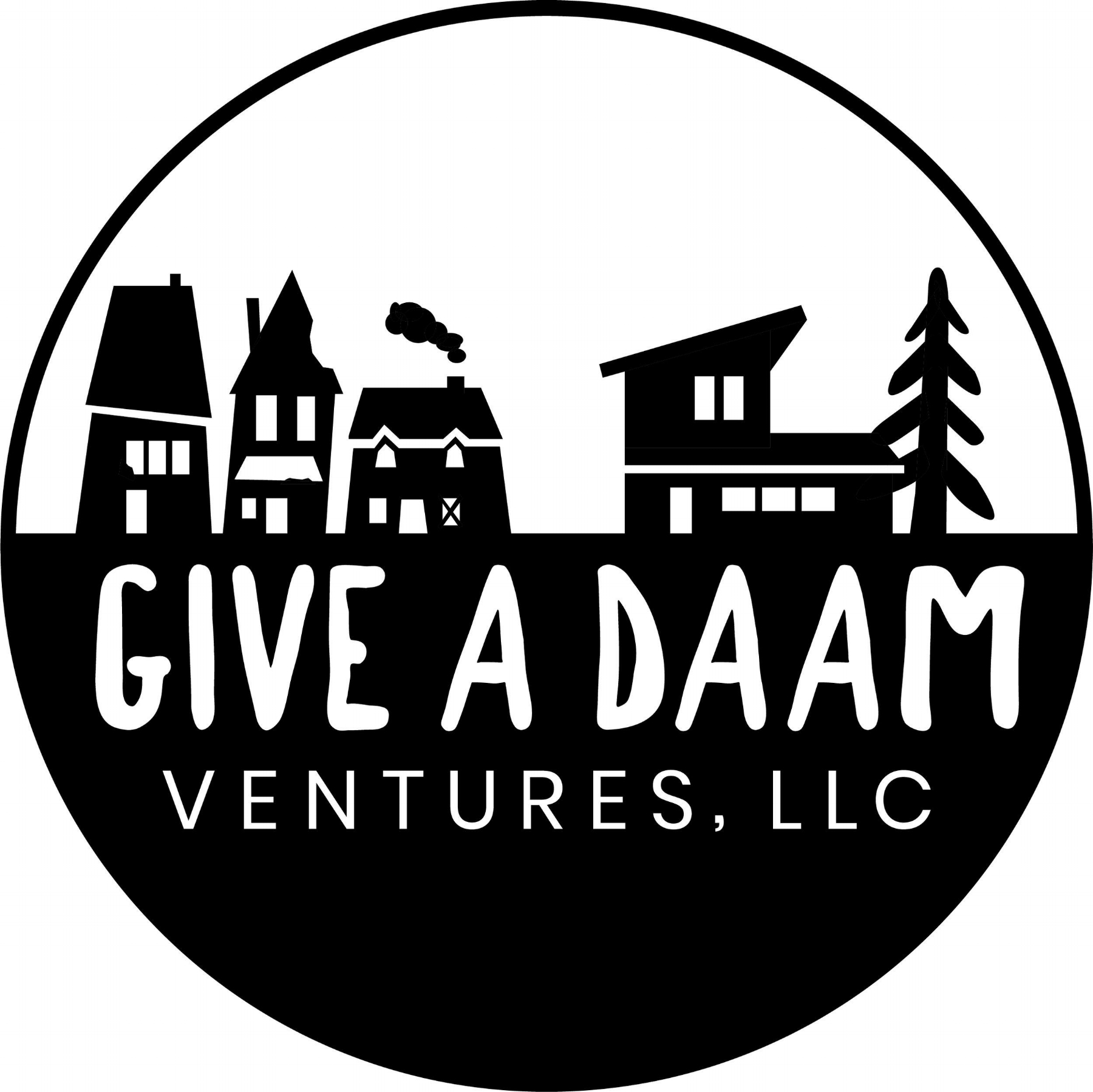
Giveadaam Ventures, LLC.

8
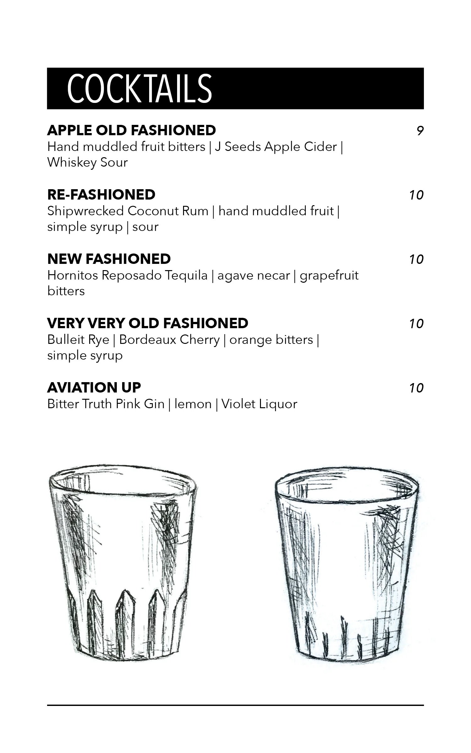
Skaliwags Menus

10
Logo Challenge 2018

8
Letter Challenge 2018

3
Leave Behind

12
Hayward Email Guidelines
2
Hayward App Icons

5
Hayward Amazon Brand Store

2
Sleeping Siren Coffee Logo
5
Ironside Computers Design